CAFE MY WAY
UX/UI RESEARCH & APP DESIGN
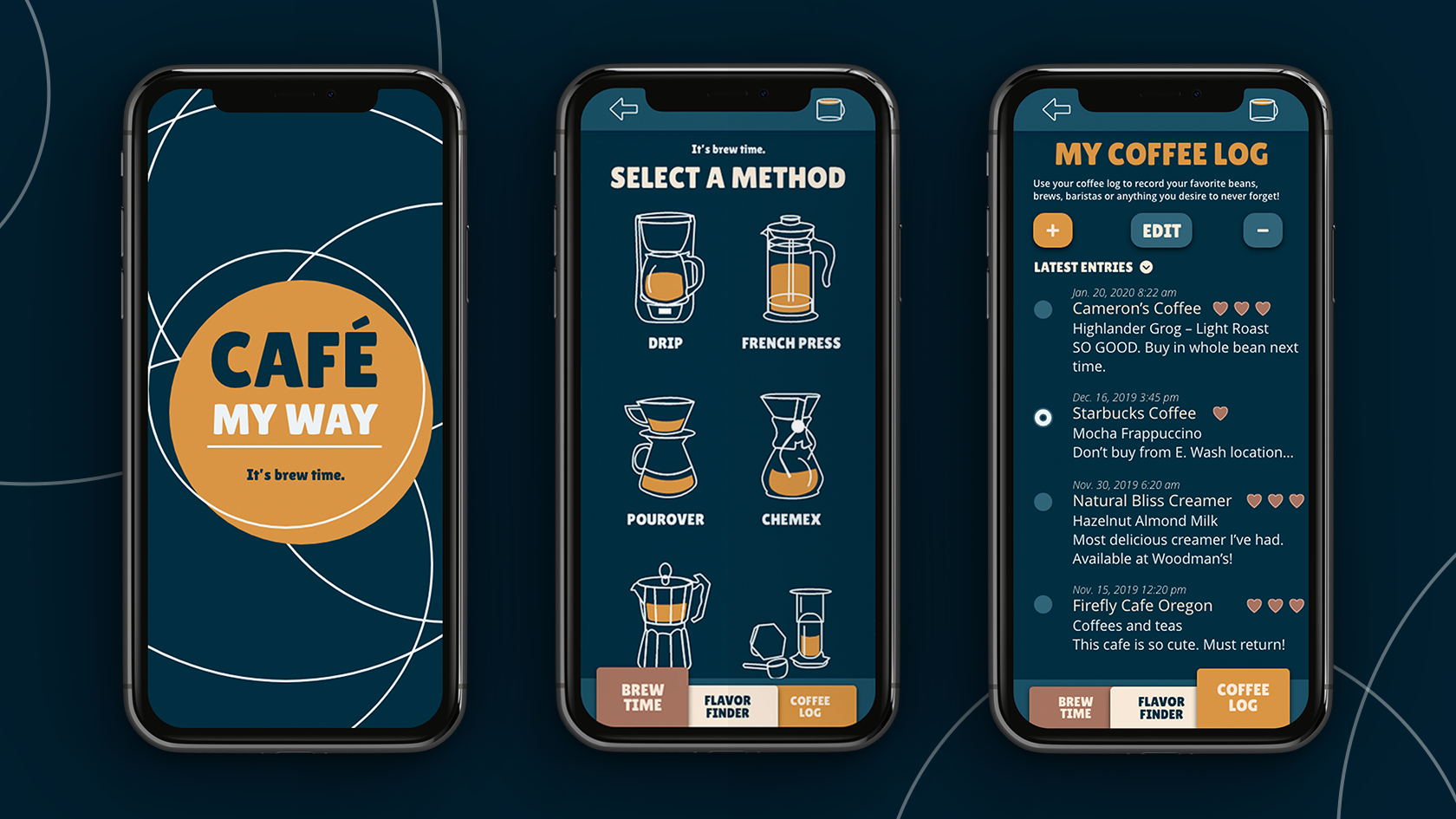
Café My Way is the app for all of your coffee needs. Learn to brew your own coffee at home, find ways to create new flavors, and save all of your coffee preferences in one easy spot. This concept was developed using real user research.
App concept and design, UX, UI, user research, and icon illustration
- Xd
- Illustrator

UX PROJECT OVERVIEW:
Click to jump to section
RESEARCH PLAN
Research Goals:
Understand and learn the following:
– What motivates people to brew their own coffee at home?
– What would they like to learn about making coffee that they don’t already know?
– What are the best ratios, methods, and recipes for all types of coffee drinks?
Research Methodology
Screener Survey:
Using a questionnaire from Survey Monkey, I will collect my responses by sending it out in a mass email to my current contact list, and then share it through multiple social media posts on Facebook.
User Interviews:
I plan to interview 3-5 different people, including a person from at least one of each of the following categories:
– A college student
– A young working adult
– And a working adult with a family
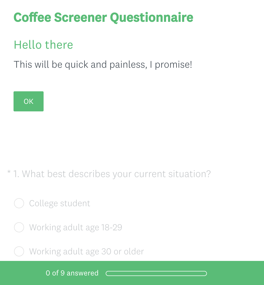
Initial User Screener Questions:
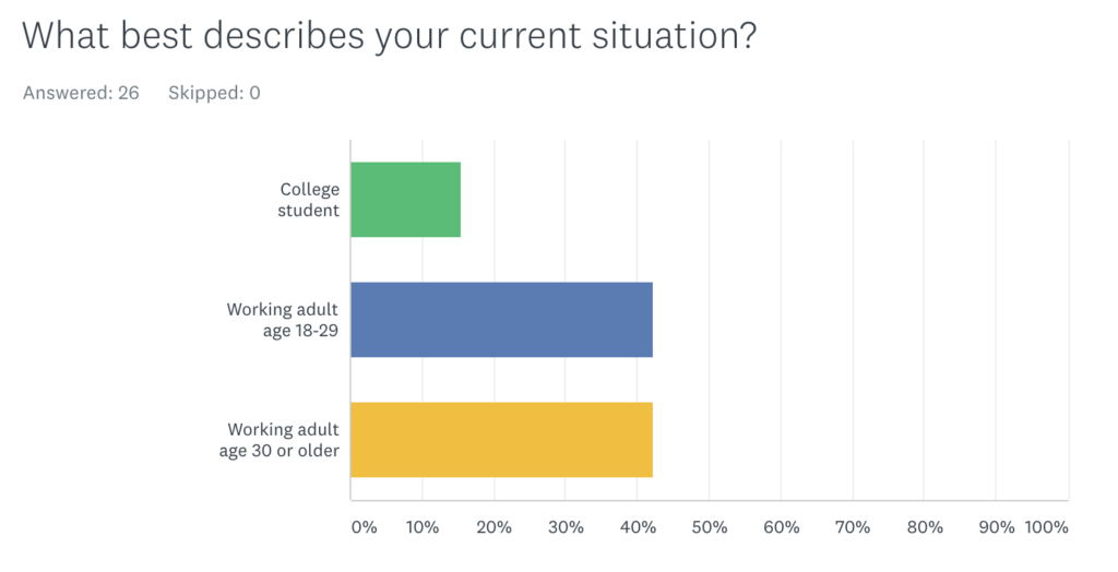
1. What is your current situation: College student or working adult?
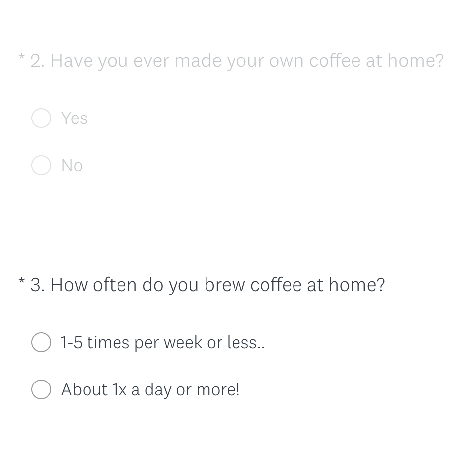
2. Have you ever or do you ever make your own coffee at home?
3. If yes, what method do you use to make coffee?
4. What is your skill level at brewing coffee?
5. What is something you wish you knew about making coffee that you don’t know right now?
Initial User Interview Questions:
1. Follow up on #5 from screener questionnaire
2. How many people do you usually make coffee for?
3. What methods do you wish you had or knew how to use?
4. What would you want from a coffee sidekick app?
5. What’s currently difficult when it comes to brewing coffee at home?
SCREENER SURVEY RESULTS
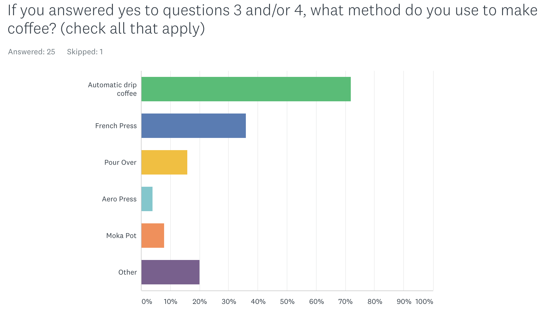
I sent out a survey using Survey Monkey to identify trends in home coffee brewing and to help select ideal users for in-person interviews. Over 20 responses were received.

IN-PERSON USER INTERVIEWS

Photo by Joshua Ness on Unsplash
Four in-person interviews were conducted. From the screener survey, they were self-marked as beginner to average proficiency in coffee brewing and had an age range of 24-34 years old.
Interview Script
• Do you brew coffee at home? (How often?)
• Do you buy coffee from any coffee shops? (How often?)
• Do you have a preference between the two? Why or why not?
• Why do you drink coffee?
• What do you like or dislike about coffee?
• Can you tell me about the last time you brewed coffee? (Just walk me through your process step by step…What method did you use? How much did you make? Etc)
• What questions run through your head before or while you’re making your coffee?
• How did you first learn this brewing process?
• How does your current process make you feel?
• Which parts do you love? Which part is frustrating?
• Do you brew coffee using other methods at home? Can you describe those for me?
[If yes, follow up] What method do you prefer best?
• Which method do you prefer the least? Why?
• Can you recall a time when you were not satisfied with how your coffee turned out at home? What happened?
FEEDBACK ANALYSIS
Interviewee #1 was surprising because they made a lot less coffee than I had perceived from their survey. They mostly buy coffee from Dunkin Donuts or the gas station. I tried to focus on why they do this instead of making coffee at home.
Interviewee #2 often made coffee at home using a standard drip coffee maker. They made coffee several times a week at home.
Interviewee #3 made coffee at home using a Keurig machine. This was helpful to learn as it was a method I had forgotten to include in the initial survey.
Interviewee #4 provided a very honest perspective from someone who enjoys grinding his own coffee beans and using multiple brew methods at home.
With the information I learned from my user interviews, it was time to build three personas.
USER PERSONAS

Sarah Bojaris
AGE: 24
OCCUPATION: Counselor
FAMILY LIFE: Long-term partner, no children
LOCATION: Racine, WI
Sarah is almost finished with grad school. She is a part-time counselor and studies psychology. Between homework and three jobs, she doesn’t have a lot of time for herself.
GOALS
• Coffee that tastes sweet and delicious
• Getting coffee must be quick and efficient
FRUSTRATIONS
• It takes a longer time to brew coffee at home than stopping at Kwik Trip
• Lack of knowledge about how to brew

Jill Hill
AGE: 45
OCCUPATION: Healthcare administration
FAMILY LIFE: Married, with two grown children
LOCATION: Middleton, WI
Jill is happily married and her kids have moved out of the house. She’s hardworking, and in her free time she enjoys photography and going on motorcycle rides with her husband.
GOALS
• Continue to brew coffee efficiently
• Make coffee taste good every time
• Try one new brew method besides drip coffee
FRUSTRATIONS
• Her husband who doesn’t want to make his own coffee
• Lack of knowledge about new ways to brew

Erik Bravo
AGE: 28
OCCUPATION: Engineer
FAMILY LIFE: Married, no children
LOCATION: Madison, WI
Erik was recently married to his wife Avril. Together they love to take their dog Marvin on long walks. Erik loves to build things, make apps, travel, and always learn something new.
GOALS
• Own every kind of home brewing method
• Understand how coffee is roasted
• Master all ratios for the best tasting coffee
FRUSTRATIONS
• Not enough time to experiment with different coffee brewing methods
MVP & USER STORIES
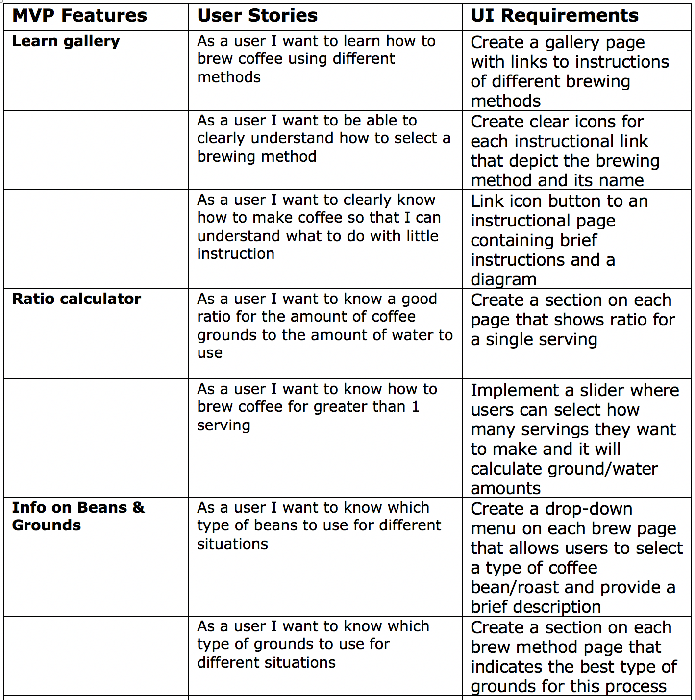
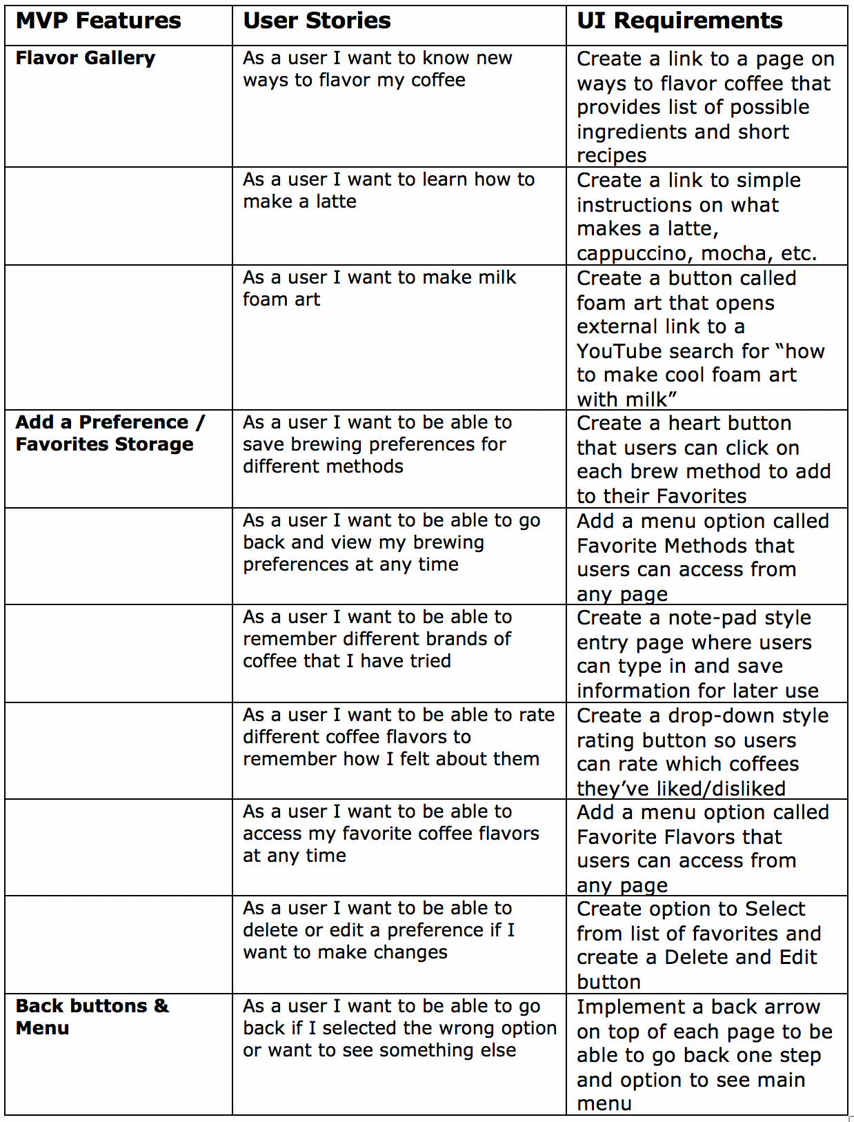
A minimum viable product (MVP) is the simplest product or service that you can offer to users and observe their actual behavior as they interact with it.
The chart below indicates which MVPs within the app will be created based on user stories.
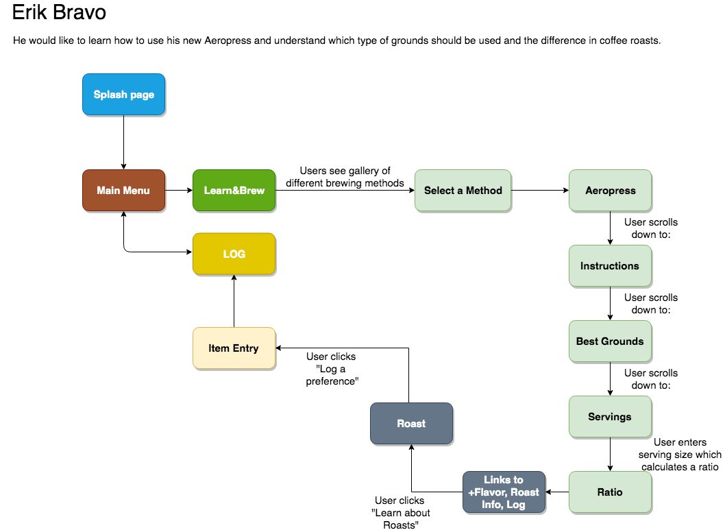
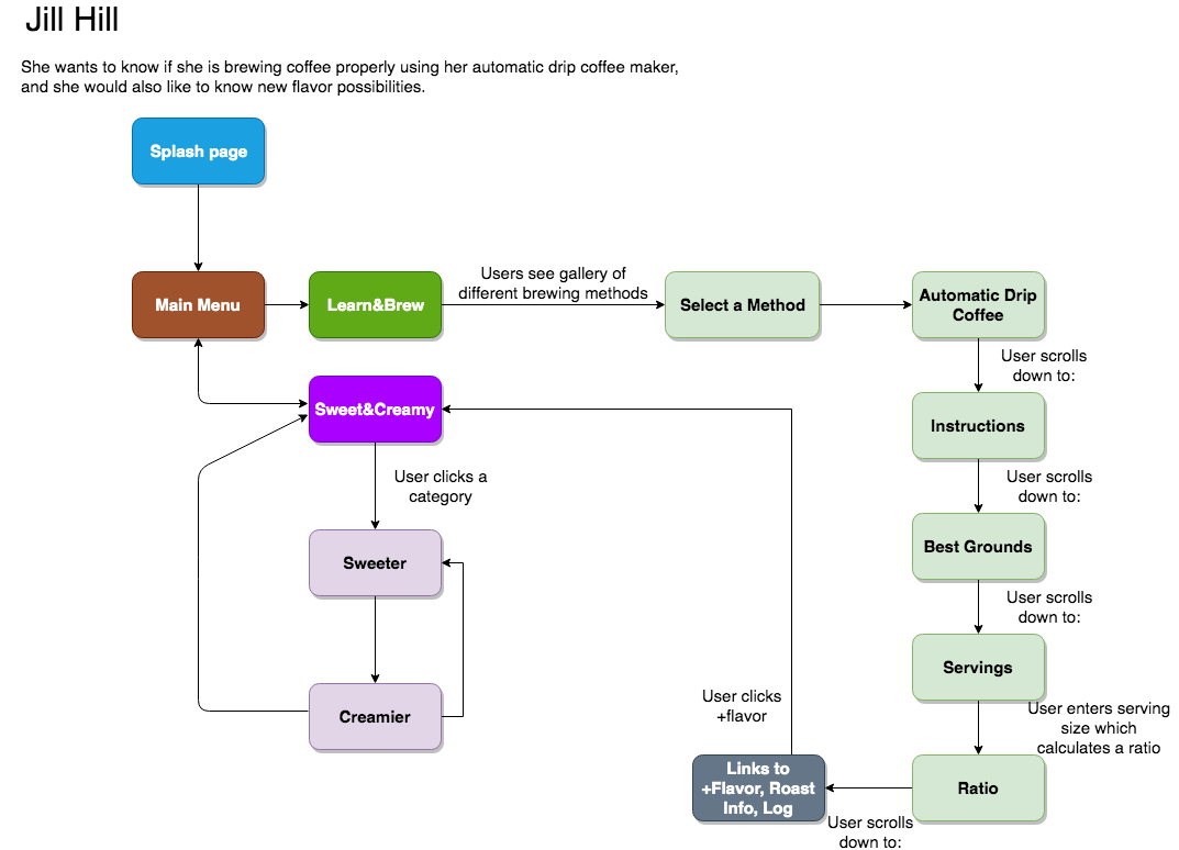
USER FLOWS
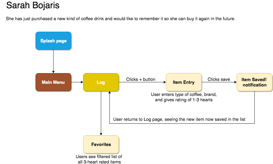
A path or map of how each user or persona might navigate through the app to meet their needs.
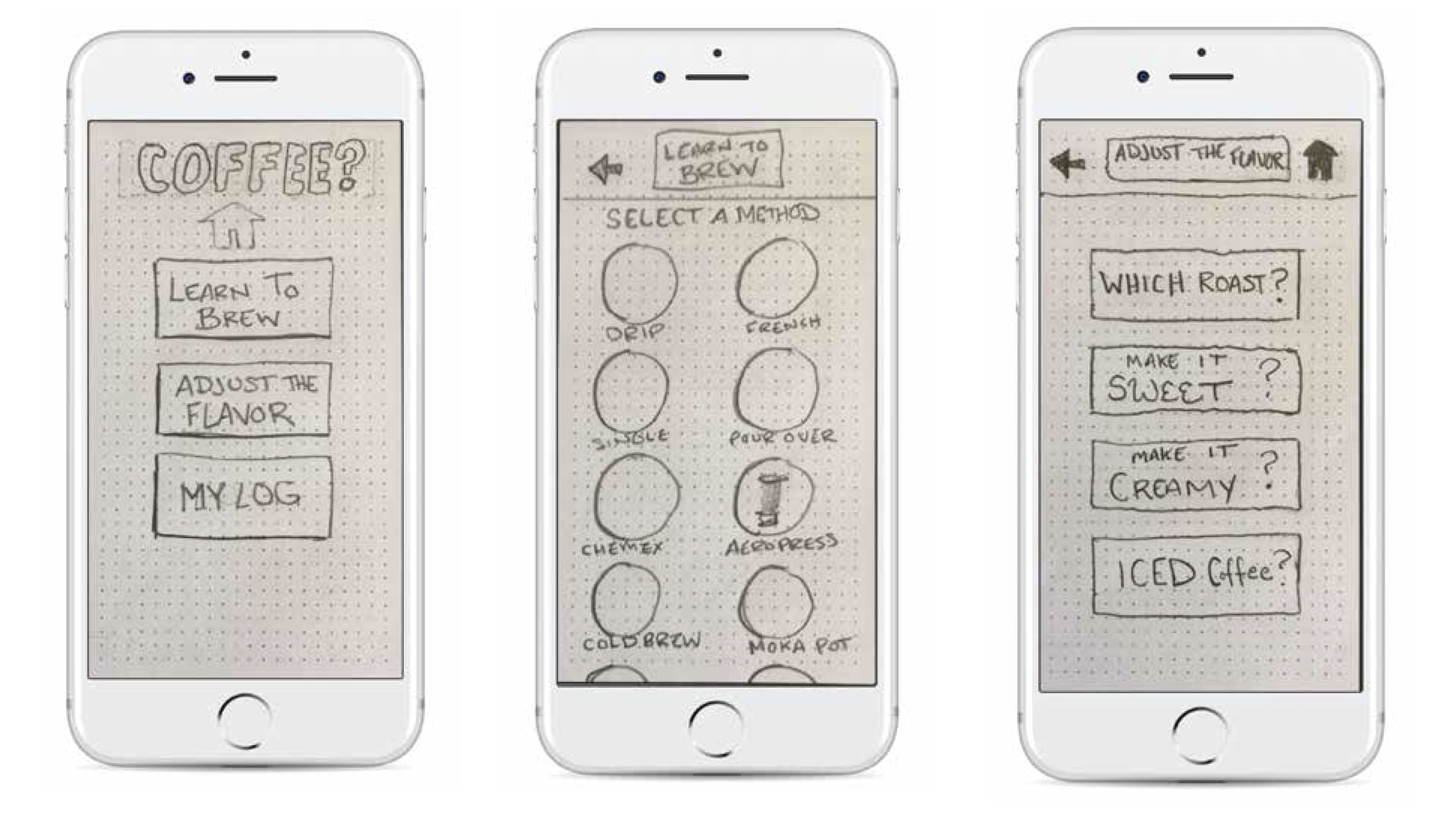
LO-FI WIREFRAME
Hand-drawn wireframes that were pieced together using the Marvel POP app:
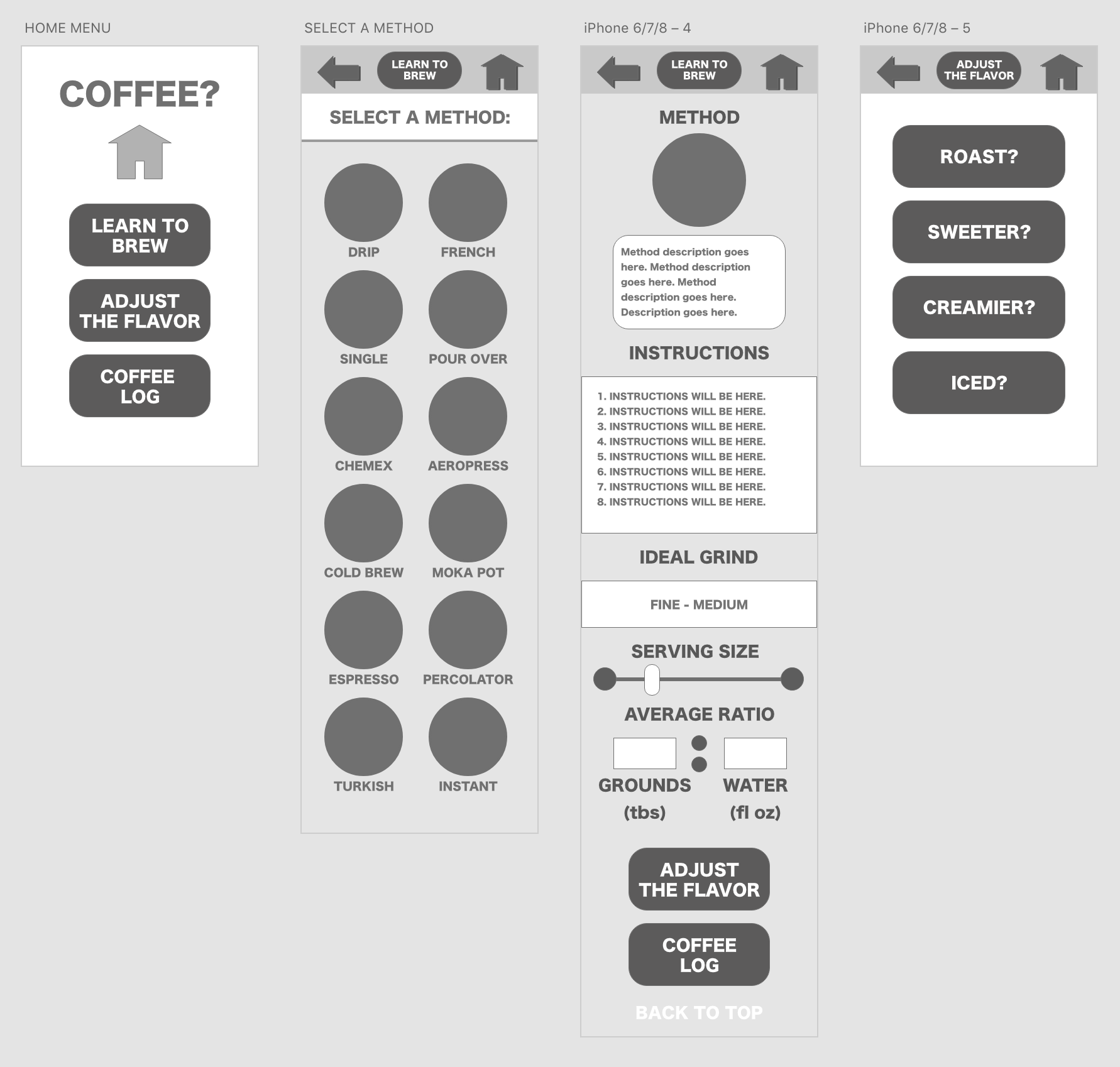
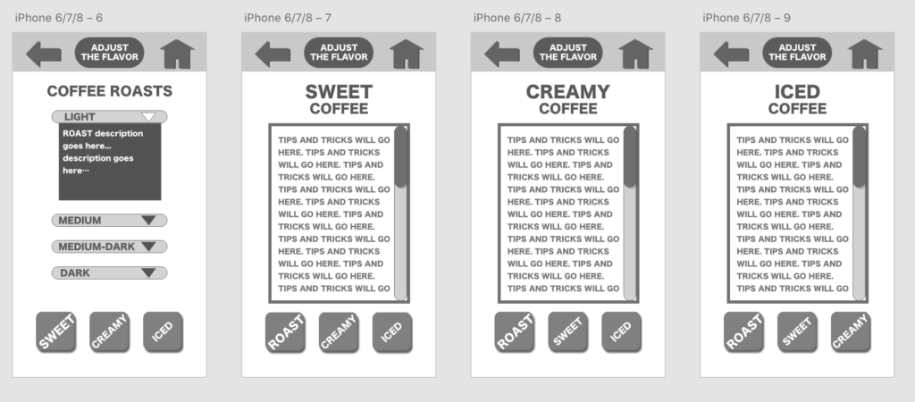
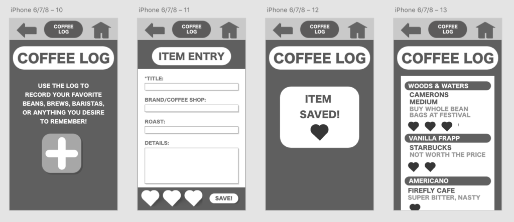
WIREFRAME
A black and white wireframe was then built using Adobe Xd.
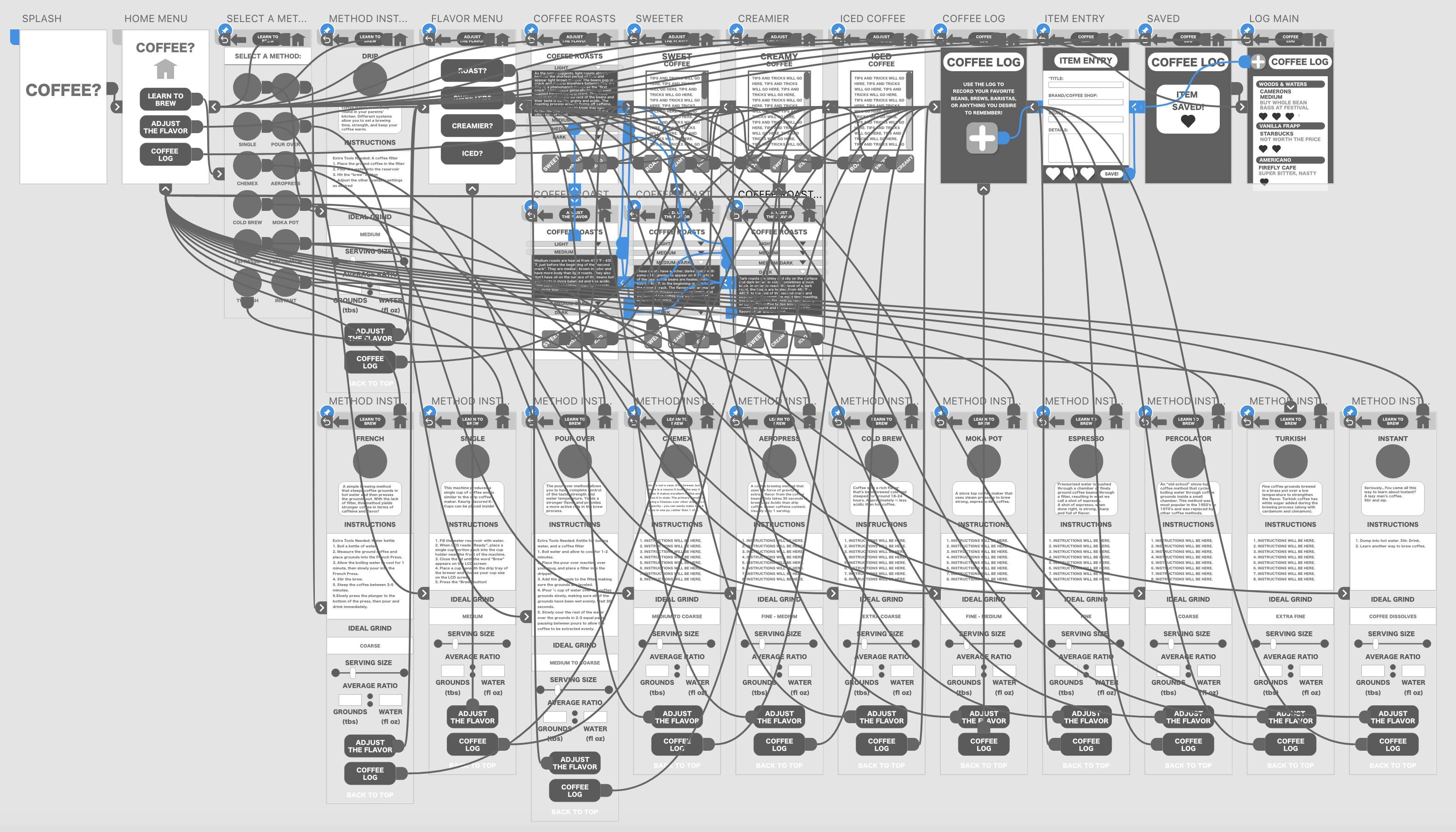
WORKING PROTOTYPE
USER TESTING
With a working prototype, it was time for user testing. Two users accessed the prototype on my iPhone using the Adobe Xd app. I observed them using the app and asked them to voice their thoughts aloud as I took notes of the comments and the way they moved through the application.
USER 1
– Tried to click the home icon on the homepage because she thought it might be a button.
-Questioned how the ratio slider functioned (an item I could not program into this prototype) “Could I enter in an amount of water, and then it would show me how many grounds to use in my French Press?”
– “What is this little mark by the hearts on the Coffee Log page?” (A design error found that I then removed.)
USER 2
– While on the learn to brew page, “I don’t even know what an aeropress is. What’s does ‘single’ mean? OH! It’s like a k-cup!” She was quickly learning about the ways to brew.
– Easily understood by looking at its design how the grounds to water ratio slider would ultimately work. “You slide the bar to select how many servings you want, and then the water and grounds ratio boxes would populate automatically.”
– When asked what part(d) would she actually use in the app, she said, “I would use the coffee log and the grounds to water calculator. Otherwise, I’d probably just keep Googling everything else.”
UI STYLE GUIDE AND REDESIGN
Finally it was time to style the user interface and brand the application. The following results are the UI Style Guide, mockups of the application, and a link to the final designed prototype in XD.

